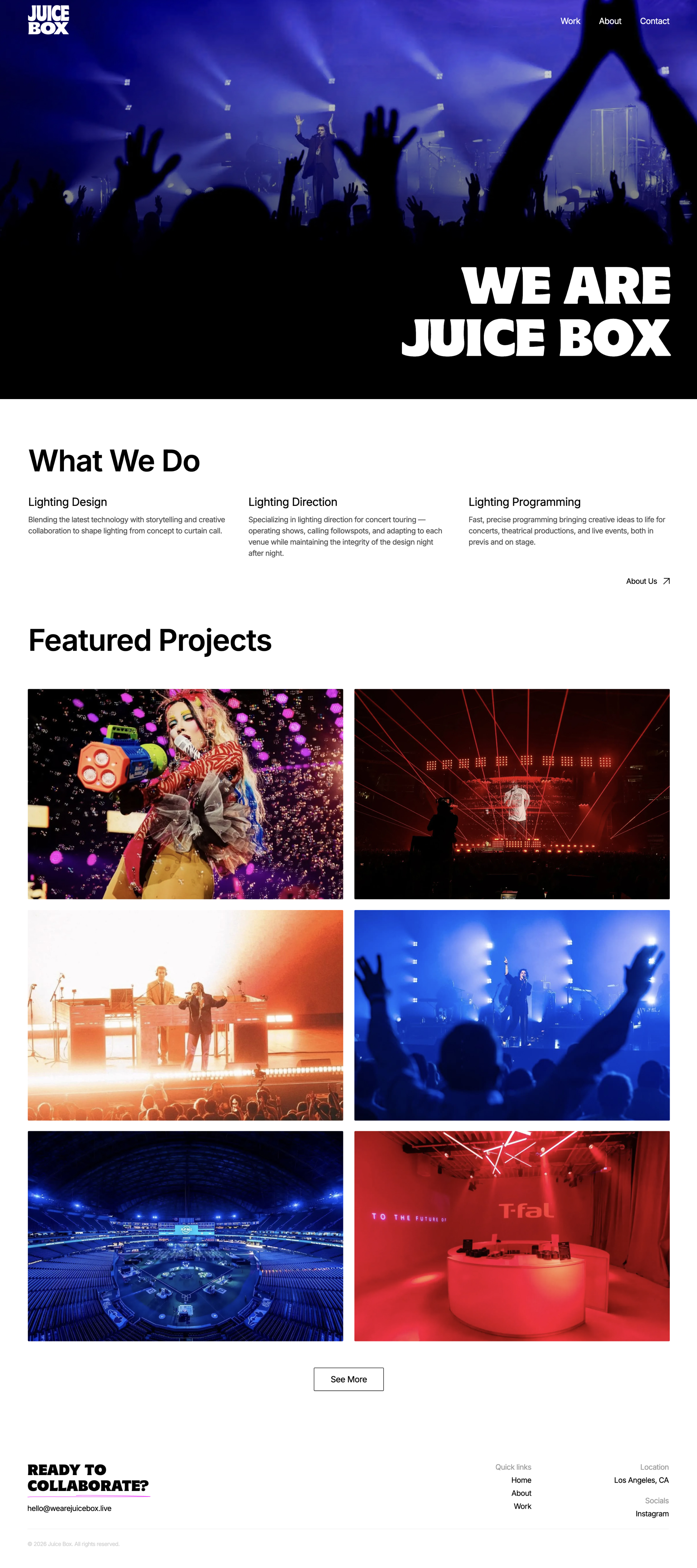
A website designed to help Juice Box get discovered by venues and event producers scouting concert lighting designers – built to showcase their portfolio of live lighting work and make it easy for the right prospects to reach out.
Designer, Webflow Developer
Figma, Webflow, Photoshop
Q1 2026
Juice Box was in the middle of a brand refresh, reworking their logo and overall visual identity – and needed a website to match.
The client's goal was straightforward: use the site as a tool to get discovered by companies looking to hire lighting designers, whether through direct outreach or being found organically. That meant the site needed to do more than look nice – it had to position Juice Box as experienced and high-quality, credible enough that a venue or producer would trust the company with their event.
The client wanted the site to feel modern and clean, but "clean" is in tension with what lighting design actually is: bold, saturated, experiential. Getting the balance right was the core design problem.
Colour was the first problem. Introducing brand colour risked clashing with the vibrant, unpredictable colour palettes already present in concert lighting photography – the photos needed to lead, not compete with a colour system. Going full black-and-white solved the clash while creating a new problem: it read as too corporate and sterile for a creative, high-energy industry.
The second challenge was scale and restraint. The site needed to show enough visual work that a venue or producer could tell Juice Boxi had real, varied experience – different artists, different scales of production – without the website turning into an overwhelming image dump.
To bring colour into the site without competing with the vibrancy of concert photography, the client wanted to implement fundamentals of lighting design itself – cyan, magenta, and yellow. Rather than using these as visible brand colours, I wove them into interactions: a CMY flash on buttons and the loading screen, and a CMY gradient that appears over the services section on hover for an added interaction. The colour lives in the experience of using the site, not in the static layout – keeping the site clean while echoing how lighting itself transforms a space only when it is active.
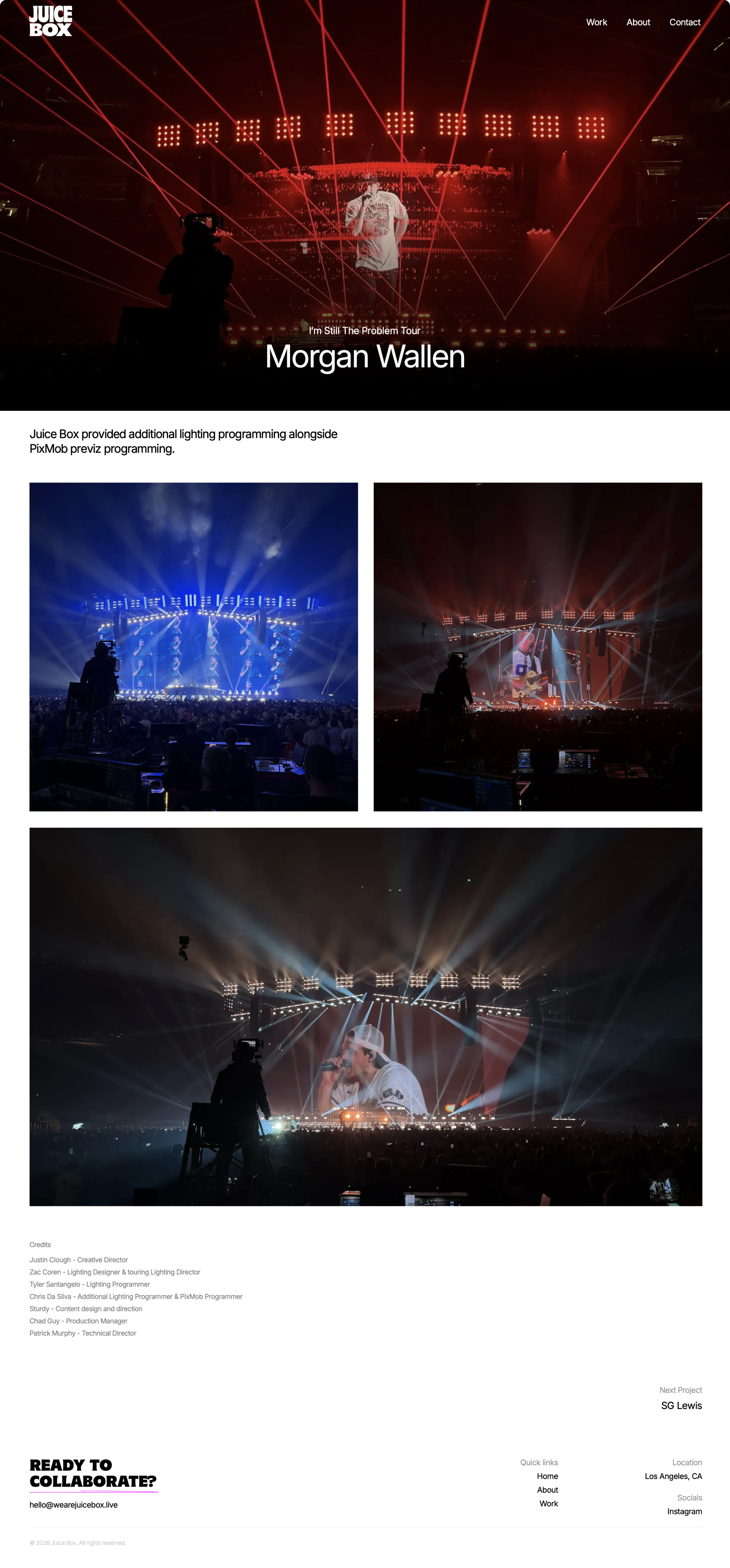
Since featured work would need to rotate regularly, especially as new projects came in and older ones needed reshuffling – I built a custom CMS structure the client could manage independently, covering both the homepage feature and the full work page.
Webflow's CMS doesn't natively support a "next item" link from a CMS template page. I built a custom CMS-driven solution to let visitors move seamlessly from one project to the next, keeping them browsing the portfolio rather than dead-ending on a single page. It allowed the client to control the "next item" of each show.
Lighting photography needed to stay large and high-impact, but that came at a performance cost. I compressed all imagery to the smallest file size possible without a visible drop in quality, keeping the site fast without sacrificing visual impact.
Collaboration with the client happened in real time. Changes came in over text as the client reviewed the site in progress, and we held regular check-in calls to walk through pages together rather than relying on written feedback alone. Every round of notes was consolidated into a shared document so nothing got lost between calls, this allowed us to keep a lightweight system that kept a fast-moving, informal process accountable.
A closer look at the final design – see how the brand's clean, minimalist aesthetic translates across the homepage, CMS collections.