Planning and running mixed-methods research to understand how members use a certification resources learning platform, and turning what I heard into scoped design decisions.
UX Designer, research lead (planning, recruitment, moderation, synthesis)
SurveyMonkey, ActiveCampaign, Zoom, Google Docs
4 weeks, Q3 2025
WBE Canada was looking to improve its member-only platform geared towards providing members access to learning resources to make the most of their certification and membership. One of the primary areas needing improvement was the Certified WBE area, a space for women-owned businesses to watch lessons, read, and learn more about their certification and business development. Rather than improving the Certified WBE area based on our assumptions, I saw it as an opportunity to rethink it around how members actually navigate and use it. Before touching the design, I wanted the redesign to be driven by evidence, not assumptions about what members wanted.
Being WBE Canada's only designer, I also wanted to build a research approach that could scale: a repeatable baseline we could later extend to other user groups like Members and Partners, and a foundation for follow-up methods such as usability testing once the redesign shipped.
Going in, the team held four hypotheses about why the Certified WBE area was underused. I treated each as an assumption to investigate rather than a fact:
1) Members underuse the area because the layout makes it hard to find relevant content.
2) Sequentially gated content (having to watch one program to unlock the next) discourages members from working through it.
3) The content isn't relevant to members' actual businesses.
4) Members judge content as less valuable when it looks dated, for example older recordings.
I translated these into research questions across two lenses:
Quantitative: How often do members use the Certified WBE area?
Qualitative: Do members get value from it?
Both: What are members actually using it for?
I chose a mixed-methods design. A short survey prior to the interviews gave me a quantitative read on usage frequency and satisfaction and doubled as the recruitment funnel for interviews. Semi-structured generative interviews then gave me the depth to understand attitudes and behaviours behind the numbers. I kept the interview format semi-structured on purpose: enough consistency to compare across participants, enough flexibility to follow unexpected findings. For sample size, I followed Nielsen Norman Group guidance that a small number of participants surfaces the majority of issues with diminishing returns beyond that, and ran 7 interviews.
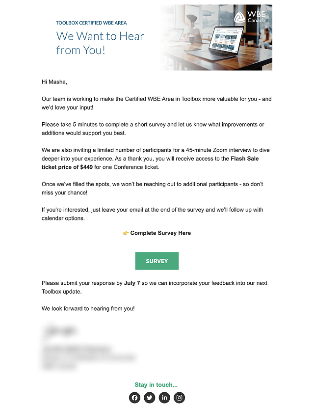
The survey went out to certified business owners through the community team, under the Director of Certification's name to build rapport and trust. Members who opted in, filled out the survey and left their contact details. Members who were not interested in the research, filled out the survey omitting the contact details part, still leaving us with some quantitative research to base future decisions on. I then reached out personally to schedule sessions, with a follow-up sequence for non-responders.
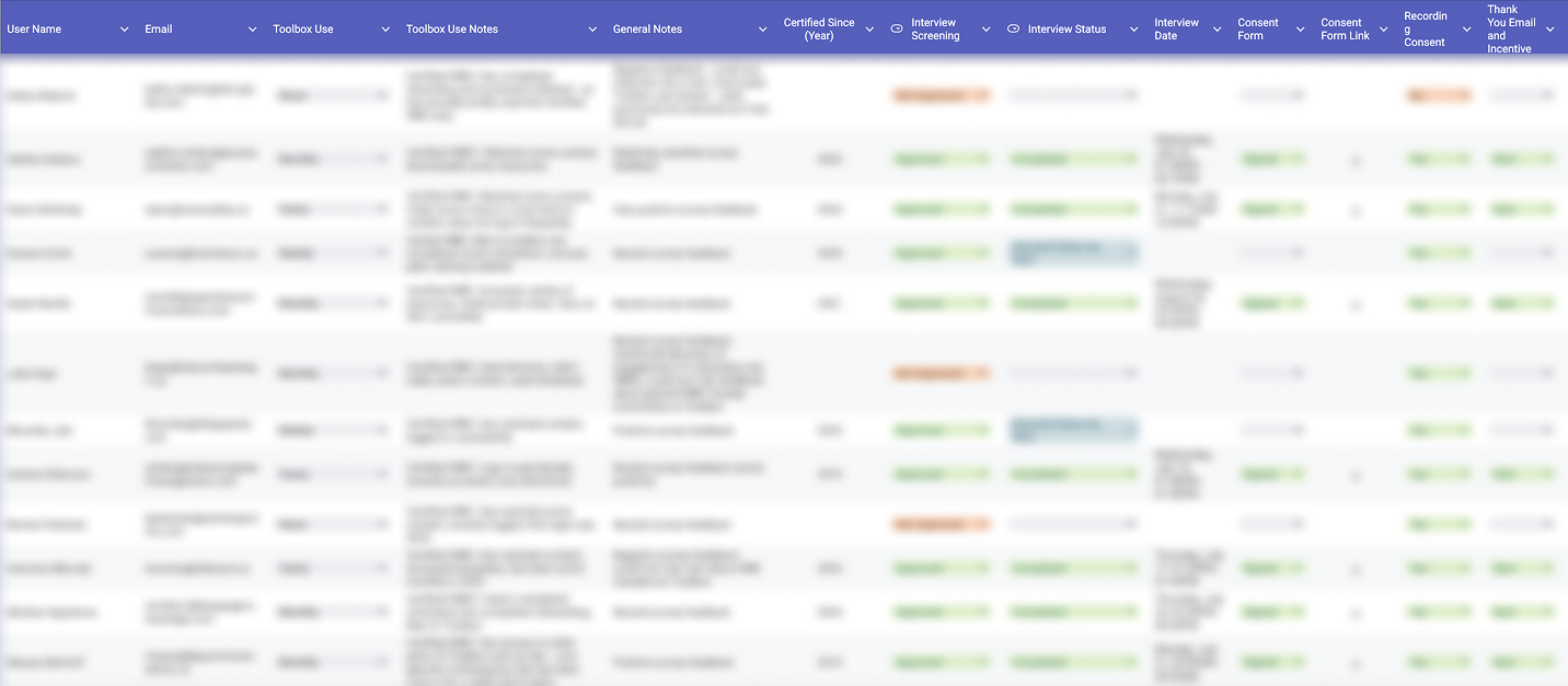
I built a screening matrix (certified WBE, employee of a certified business, prior use of the area, completed orientation) and deliberately recruited across usage frequency: a mix of higher-frequency and lower-frequency users, so I'd hear contrasting experiences rather than only from the already-engaged.
Participants received a conference ticket at a flash-sale rate. I chose an incentive to improve response rate, respect participants' time, and encourage follow-through on booked sessions.
Every participant signed a research consent form with per-item consent: to participate, to be recorded, for internal use of recordings and notes, and separately for any anonymized external sharing of findings. The form covered voluntary participation, the right to skip questions or withdraw at any time, and a clear statement that no sensitive personal information would be collected. Recordings were stored securely and used only internally.
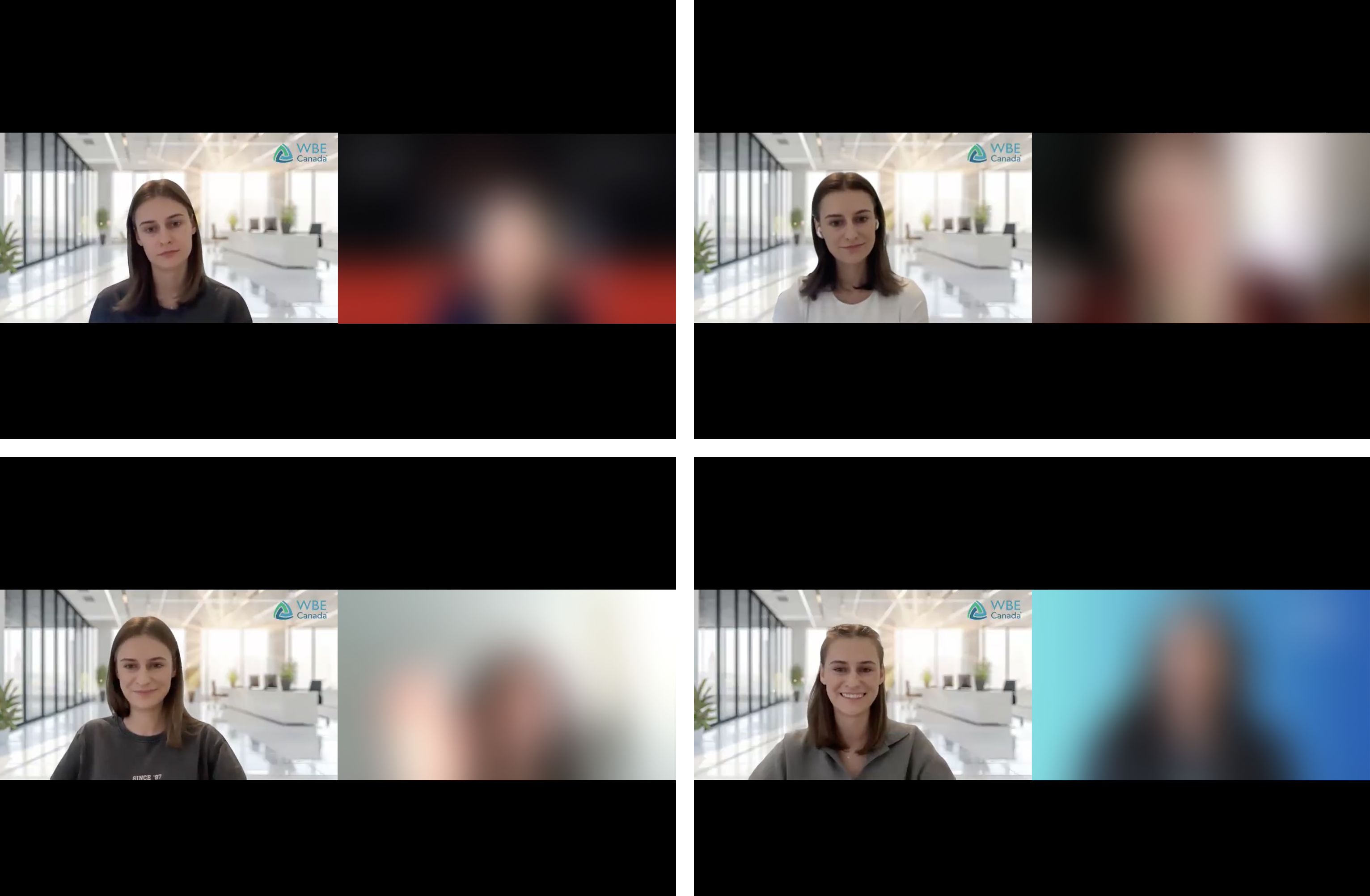
Included a short summary of the purpose of research and a spoken re-confirmation of recording consent on the record.
To build rapport before the substantive questions, I've asked participants to tell me more about their business to make the participant feel at ease by speaking about something they are well-versed in.
Questions based on what brings members to the area, their experience navigating it, how relevant the content is to their business, and an open "if you could wave a magic wand, what would you change?" prompt.
Included a "what haven't I asked that would be valuable?" and permission to follow up for future research.
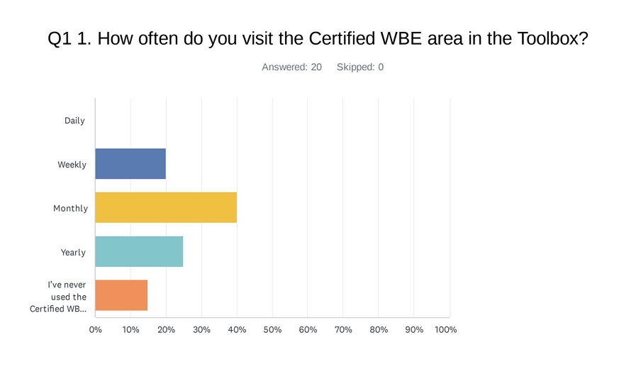
The survey and the interviews told the same story, which gave the findings weight well beyond a small sample.
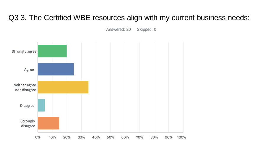
Six of seven interviewees said they rarely used the Certified WBE area, and the survey confirmed it: most respondents visited only monthly or yearly, overall satisfaction was at "neutral," and when asked whether the content aligned with their business needs, the most common answer was "neither agree nor disagree."

I haven't spent a lot of time in the toolbox, but I go every once in awhile when I need stuff right? And and the things I do need are the events, information on the events, and the and the corporateMember Directory for solicitation.
Typically, I don't connect as often as I should. But when I do, itwould be to go to the latest updates section just to see if there's anyopportunities that might be relevant to us any events coming up.
Members were frustrated that they couldn't skip to the content they wanted, and that locked items never explained why they were locked or how to get access. One member described logging in, clicking something, and being blocked – "it's locked, it's only for WBE certified, and I am WBE certified." Another wanted "an option to go to [videos of interest] right away instead of going through all the locked videos."
Members described hunting through several sections to find things, and were confused by content duplicated across the homepage, a sidebar, and the global navigation – "are all of those the same thing?" one interviewee asked.
Content was often too long ("too long, I tweak out after 15 to 20 min"), too foundational for established businesses, and unclearly labelled ("what's the difference between orientation and success path?").
Unlike the learning content, the corporate member directory drew positive feedback and was one of the top reasons members visited the Certified WBE area at all. They asked for it to go further: a "last updated" date for trust, and a single place to see all corporate RFPs.
The research confirmed the gating hypothesis strongly and the findability hypothesis through navigation friction. Relevance was real but less of an issue than assumed, mainly a problem for more established businesses. And the assumption that dated content drove disengagement barely surfaced, so I set it aside. Noting what the assumptions got wrong mattered as much as confirming what they got right.
I scored every recommendation on a simple value-versus-effort matrix, user value against organizational effort, so the team could act on the research rather than just read it. High-value, low-effort items were things to do now; high-value, higher-effort items were scoped into the platform future redesign; and a few requests I flagged as needing validation before committing effort.
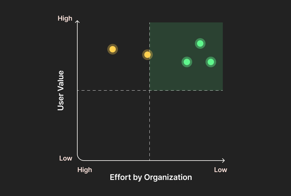
Remove unlock-gating while keeping progress tracking
High / Low
Now
Rewrite locked-state messaging (why locked, how to access)
High / Low
Now
Add "last updated" dates to Corporate Member proflies
High / Low
Now
Cap lesson length and break long videos into microlearning
High / Medium
Redesign
Consolidate duplicated menus into a single global navigation
High / High
Redesign
Community forum and member messaging
Needs validation / High
Validate first
The research turned a vague sense that "the area is underused" into a prioritized, evidence-backed plan. It confirmed which assumptions were real (gating and navigation), corrected one that wasn't (dated content mattered far less than we assumed), and surfaced the directory as an underused strength to build on.
The high-value, low-effort fixes were done immediately, and the larger findings set the design direction for the Certified WBE area going into future platform redesign. Just as importantly, it gave WBE Canada its first repeatable, ethically-run research method, one that the team can extend to other user groups.


